
New purple design
+5
EarlFan
Paula74
phantomgirl110
SenorSwanky
operafantomet
9 posters
Page 1 of 1

Do you like the new purple design for POTO in West End?
New purple design
![]() operafantomet Tue Sep 29, 2009 9:52 am
operafantomet Tue Sep 29, 2009 9:52 am
Yes, no or couldn't care less? Why/why not?
Also, opinions on other Phantom PR design, from the original with the rose and the hand, to the sexed-up US versions? Pictures of your favourite?
Also, opinions on other Phantom PR design, from the original with the rose and the hand, to the sexed-up US versions? Pictures of your favourite?

operafantomet- Posts : 3600
Join date : 2009-09-21
Age : 44
Location : Norway -

Re: New purple design
![]() SenorSwanky Tue Sep 29, 2009 9:58 am
SenorSwanky Tue Sep 29, 2009 9:58 am
I don't like anything but the classic, original designs. No purple, no badly painted trashy romance novel designs, and certainly not the new US poster without the "of the Opera."
I'm open to different things, but I have yet to see RUG tinker with something that works and succeed.
I'm open to different things, but I have yet to see RUG tinker with something that works and succeed.

SenorSwanky- Posts : 1632
Join date : 2009-09-25
Age : 39
Location : Raleigh, NC -
Re: New purple design
![]() operafantomet Tue Sep 29, 2009 9:58 am
operafantomet Tue Sep 29, 2009 9:58 am
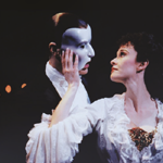
Original logo with hand and rose. Apparently it was edited because it looked too much like the concept album one for "By Jeeves" (or so I've been told, anyway. When looking it up online, they DO look a lot alike). I'm glad it was ultimately changed, I think it looks a bit campy, but I enjoy it for its rarity.
operafantomet- Posts : 3600
Join date : 2009-09-21
Age : 44
Location : Norway -
Re: New purple design
![]() SenorSwanky Tue Sep 29, 2009 10:07 am
SenorSwanky Tue Sep 29, 2009 10:07 am
By "original," I meant the one they finally settled on with the top-half-of-the-face mask (occasionally glimpsed with the rose as well). I'm glad at least in London, unlike in America, they've stuck with the same fonts (including the cracked-glass one), but the increasingly flashy and flamboyant color choices I don't like.
SenorSwanky- Posts : 1632
Join date : 2009-09-25
Age : 39
Location : Raleigh, NC -
Re: New purple design
![]() phantomgirl110 Tue Sep 29, 2009 10:30 am
phantomgirl110 Tue Sep 29, 2009 10:30 am
Classic for me, thanks.

<3
With or without the rose, with or without the small print. I consider them both to be "the classic" since they seem to be used interchangably. I'm alright with several variations of the mask-and-rose-on-black theme ("Do You Remember Your First Time?" "Eternally Yours" etc.), but lately even those have been made too garish and colorful for me. Must there be a technicolor background?
I've also always loved the "Phantastic" poster with Red Death on it, which I can't seem to find a good picture of. (Ironic, considering I own the thing.)
My least favorites are the current US design, the London design from a few years ago that starred Christine's bare back, and the current Las Vegas design. >_>
EDIT: Oh, and as for the actual subject of the poll - hehe - I voted "whatever" simply because I don't hate the purple as much as I've hated certain other designs, but I don't care for it either. But now that I've voted, I wish I'd just said no.
phantomgirl110- Posts : 246
Join date : 2009-09-21
Age : 36
Location : San Francisco Bay Area -
Re: New purple design
![]() operafantomet Tue Sep 29, 2009 11:28 am
operafantomet Tue Sep 29, 2009 11:28 am
I didn't post the picture overneath to correct you, we cross-posted eachother. Just thought it would be interesting to see where it all started, design wise. I agree with you on the newer US posters - why do they have to make it so tacky? Sadly, I think the new London ones look a tad tacky too. Yes, there is a certain campy quality to POTO, with the loud organ and the post-modernistic approach as only the 80's managed it. But there is a limit to how cheesy they can make the porters look. When it's border-lining cheap dinner-theatre posters and/or romance novel covers, I don't think it reflect the content of the show - I prefer the more neutral ones, or the ones in sync with the visuals of the show.SenorSwanky wrote:By "original," I meant the one they finally settled on with the top-half-of-the-face mask (occasionally glimpsed with the rose as well).
Although, I used to think I preferred the full logo. I do, for the most, but I must admit it was more eye-catching with them using just "Phantom" with the O replaced with the mask (think London T-shirts) in the Det Ny Teater facade (they used the full logo in 2000-2003):
But on brochures and larger posters etc - full logo for me, thank you very much.
operafantomet- Posts : 3600
Join date : 2009-09-21
Age : 44
Location : Norway -
Re: New purple design
![]() operafantomet Tue Sep 29, 2009 11:44 am
operafantomet Tue Sep 29, 2009 11:44 am
When that is said.... I'm loving this one, for the 20.th anniversary in London:

operafantomet- Posts : 3600
Join date : 2009-09-21
Age : 44
Location : Norway -
Re: New purple design
![]() Paula74 Tue Sep 29, 2009 3:54 pm
Paula74 Tue Sep 29, 2009 3:54 pm
In general, I'm in favor of anything that maintains the original classic elements - black background, shattered letters, and optional rose. I don't mind updating or adding to those main elements to give it a fresh look or do something for a special occasion...but let's not get crazy with too much mists, masked Ken doll faces, romance novel covers...and so on.

Paula74- Posts : 629
Join date : 2009-09-22
Age : 50
Location : Monsieur Madeleine's office -
Re: New purple design
![]() EarlFan Tue Sep 29, 2009 5:24 pm
EarlFan Tue Sep 29, 2009 5:24 pm
Voted "no". Even if I like that they try to keep the show fresh I don't like the idea of doing it by changing everything to purple.

EarlFan- Posts : 278
Join date : 2009-09-21
Location : Sweden -
Re: New purple design
![]() Scorp Tue Sep 29, 2009 6:24 pm
Scorp Tue Sep 29, 2009 6:24 pm
Is there anything we can actually do about it? Or will we just get ignored? Surely our input must count to some degree or else HM's wouldn't have changed the programme back to black after the RUG launched its white design for all Really Useful Theatres. To this day HM's remains the only Really Useful Theatre to use a black programme.
I'd also be very happy if someone told whichever idiot came up with that HIDEOUS new poster for the US Tour to change everything back and then resign.
I'd also be very happy if someone told whichever idiot came up with that HIDEOUS new poster for the US Tour to change everything back and then resign.

Scorp- Posts : 1308
Join date : 2009-09-21 -
Re: New purple design
![]() starryeyed Tue Sep 29, 2009 6:32 pm
starryeyed Tue Sep 29, 2009 6:32 pm
I'll maybe loudly complain about in the foyer on Saturday. I guess yes if enough people mentioned it but the thing is with the programmes I guess they just had to wait until the batch was sold and then change it back. But with this they would have to take down the signs and whatnot... perhaps more bother than it is worth for them?
starryeyed- Posts : 836
Join date : 2009-09-22
Re: New purple design
![]() Helen Tue Sep 29, 2009 11:10 pm
Helen Tue Sep 29, 2009 11:10 pm
I voted no. I like the shade of purple, I just think the black suits the show a bit better.
Helen- Posts : 251
Join date : 2009-09-28
Re: New purple design
![]() SenorSwanky Wed Sep 30, 2009 2:13 am
SenorSwanky Wed Sep 30, 2009 2:13 am
I like the "PHANTOM" with the mask in place of the "O," and some of the London posters that are just snazzier updates of the classic design, like the 20th-anniversary ones, are nice. But I don't like when they changed the "Do you remember your first time?" billboard in Times Square to have a purple mist instead of the black background, nor do I like the matte neon purple they're using now in London.
SenorSwanky- Posts : 1632
Join date : 2009-09-25
Age : 39
Location : Raleigh, NC -
Re: New purple design
![]() Riene Wed Sep 30, 2009 3:39 am
Riene Wed Sep 30, 2009 3:39 am
Is there a photo of this new purple design anywhere?

Riene- Posts : 100
Join date : 2009-09-22
Location : USA -
Re: New purple design
![]() SenorSwanky Wed Sep 30, 2009 4:31 am
SenorSwanky Wed Sep 30, 2009 4:31 am
Check the last two pages of the London Production thread.Riene wrote:Is there a photo of this new purple design anywhere?
Y'know, it's a little ironic, I just realized, that I oppose the purple posters when my avatar (which I created a few years ago) is tinted purple. But it's a muted purple with plenty of shadows and depth, unlike the flat, bright purple background of the posters.
SenorSwanky- Posts : 1632
Join date : 2009-09-25
Age : 39
Location : Raleigh, NC -
Re: New purple design
![]() Scorp Thu Oct 01, 2009 2:31 pm
Scorp Thu Oct 01, 2009 2:31 pm
ruthy wrote:I'll maybe loudly complain about in the foyer on Saturday. I guess yes if enough people mentioned it but the thing is with the programmes I guess they just had to wait until the batch was sold and then change it back. But with this they would have to take down the signs and whatnot... perhaps more bother than it is worth for them?
Ooh, you're going this Saturday?
And yes, that's true that the programmes could be changed a lot more easily. But then again, it's not as if this particular production hasn't generated sufficient £££ for them to change the signs a million times over.
Even if they kept the posters purple but made the hanging signs and/or the signs either side of the 'Her Majesty's Theatre' sign at the front, it would make such a big difference (for the better). I'm not anti-change, but am I anti-stupid decisions. I repeat I would never forgive them if they adopted that disgusting poster they're using all over the States at the moment. I hope that dies soon.
Do mention it in the foyer. Heck, mention it to the actors if you're stage-dooring. I was sad enough to say 'What's with the purple signs' to the Box Office on Wednesday (but received a confused look initially, before the poor woman said it wasn't her fault and she couldn't do anything about it).
So that people can compare and contrast...
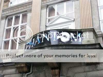
BEFORE (1986-2009):

NOW (2009-hopefully very soon):

Scorp- Posts : 1308
Join date : 2009-09-21 -
Riene- Posts : 100
Join date : 2009-09-22
Location : USA -
Re: New purple design
![]() operafantomet Fri Oct 02, 2009 8:21 am
operafantomet Fri Oct 02, 2009 8:21 am
Speaking of logos, I rather liked these that were a couple of years ago:

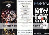
Eye-catching, in a pleasant way. And very easy to recognize.
Eye-catching, in a pleasant way. And very easy to recognize.
operafantomet- Posts : 3600
Join date : 2009-09-21
Age : 44
Location : Norway -
Page 1 of 1
Permissions in this forum:
You cannot reply to topics in this forum|
|
|